

What's changed: Deepened MLS-C01 Chapter 2 (Pearson/Spearman/VIF/log transform, AWS viz tools/pitfalls/t-SNE, two leakage kinds/preprocessing order/Glue DataBrew/time-series split + tables, scenarios, FAQ, traps; ja figures)
2.2Exploration with Visualization
See to understand—learn when to use histograms, box plots, scatter plots, and correlation heatmaps. Quickly grasp data characteristics with the right chart.
Visualization reveals patterns that raw numbers hide. Choose a chart based on what you want to learn.
2.2.1Choosing a chart
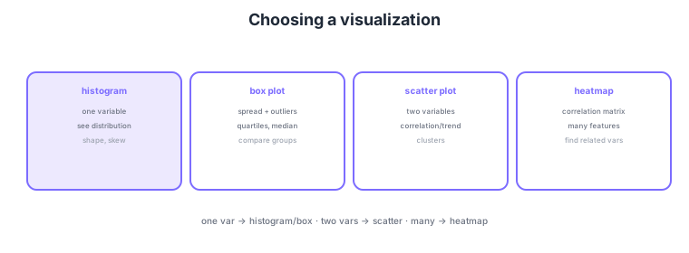
- Histogram: see one variable’s distribution (shape, skew).
- Box plot: see spread, quartiles, and outliers; handy for comparing groups.
- Scatter plot: see relationships between two variables (correlation, trend, clusters).
- Correlation heatmap: view a correlation matrix of many features at once.
Common on MLS-C01: one-variable distribution = histogram, outliers/quartiles = box plot, two-variable correlation = scatter plot, and correlation of many features = heatmap. "See outliers visually" → box plot is the classic answer.
MLS-C01 tests not just which chart shows what, but the AWS visualization options and chart pitfalls. On AWS, SageMaker Data Wrangler auto-generates a data-quality insights report (missing rates, distributions, target correlation, duplicates, leakage detection) and various charts, while QuickSight provides BI dashboards with ML Insights (anomaly detection, forecasting, natural-language narratives). For ad hoc work, use matplotlib/seaborn in a SageMaker Studio notebook. Going deeper on chart choice: a histogram’s impression depends on bin width (too coarse flattens the shape, too fine adds noise), so try several; box plots are strong for outliers and group comparison but hide bimodal distributions (use a violin plot then); scatter plots suffer overplotting with many points, so use transparency, sampling, or a density heatmap; and correlation heatmaps capture only linear correlation, missing nonlinear relationships. For high-dimensional data use t-SNE/UMAP (map to 2-D to eyeball clusters) or PCA; for time series, view line charts and decompose seasonality/trend (e.g., STL). Show class imbalance with a bar chart of counts and missingness with a missing-pattern heatmap.
| Goal | Chart / tool | Pitfall |
|---|---|---|
| One-variable distribution | Histogram | Bin width changes impression |
| Outliers, group comparison | Box/violin plot | Box hides bimodality |
| Two-variable relationship | Scatter plot | Overplotting with many points |
| High-dim clusters | t-SNE / UMAP / PCA | Interpret distances cautiously |
| Quality on AWS | Data Wrangler insights | Auto, but verify manually |
Scenario: quickly assess the quality and relationships of data with hundreds of thousands of rows and many features, without writing code. → Use SageMaker Data Wrangler’s data-quality insights report to auto-surface missing rates, distributions, target correlation, duplicates, and potential leakage, and a correlation heatmap to survey related features. To share dashboards, use QuickSight (with ML Insights).
FAQ: Q. Scatter points clump and density is invisible? A. Overplotting—use transparency, sampling, or density (hexbin/2-D heatmap). Q. Heatmap shows no relationship but there is one? A. Heatmaps capture only linear correlation; check nonlinear relationships with a scatter plot or mutual information. Q. See clusters in high dimensions? A. Map to 2-D with t-SNE/UMAP (but don’t over-trust absolute distances).
Trap: "near-zero correlation in a heatmap = no relationship" is false. Pearson measures only linear relationships, so a strong nonlinear relationship (e.g., U-shaped) can still show near-zero correlation—verify nonlinearity with a scatter plot or mutual information. Also "a histogram’s shape is always right" is wrong: bin width changes the impression.
2.2.2Section summary
- 1 var = histogram/box plot; 2 vars = scatter plot
- Correlation of many = heatmap
Sign in to track progress — Log in.
Quick check
(just a quick review)Q1. Visually check the distribution shape (e.g., skew) of one numeric variable. Which chart?
Q2. Visually check correlation/trend between two numeric variables. Which chart?
Q3. Visually inspect outliers and quartiles (spread) and compare groups. Which chart?